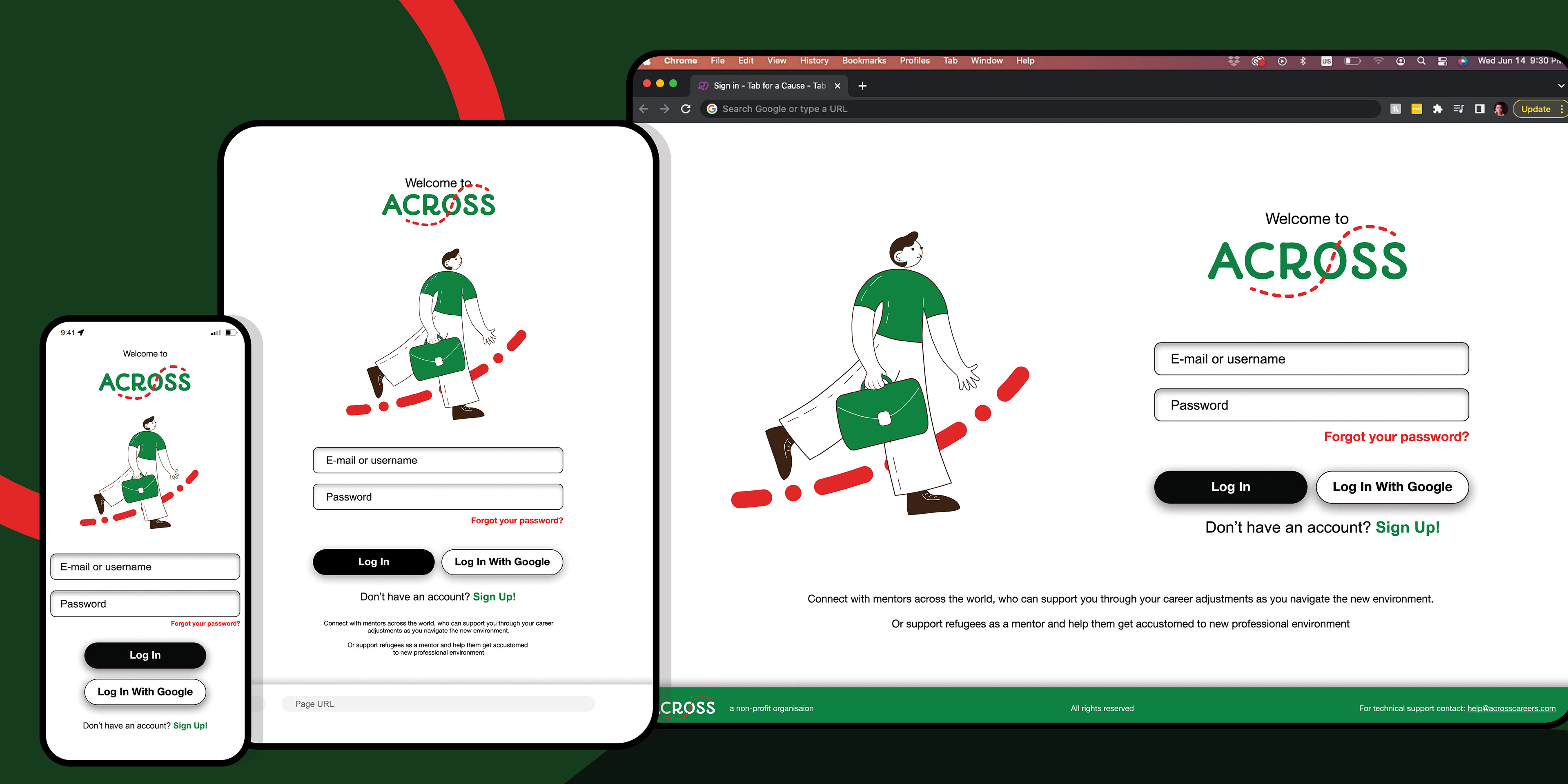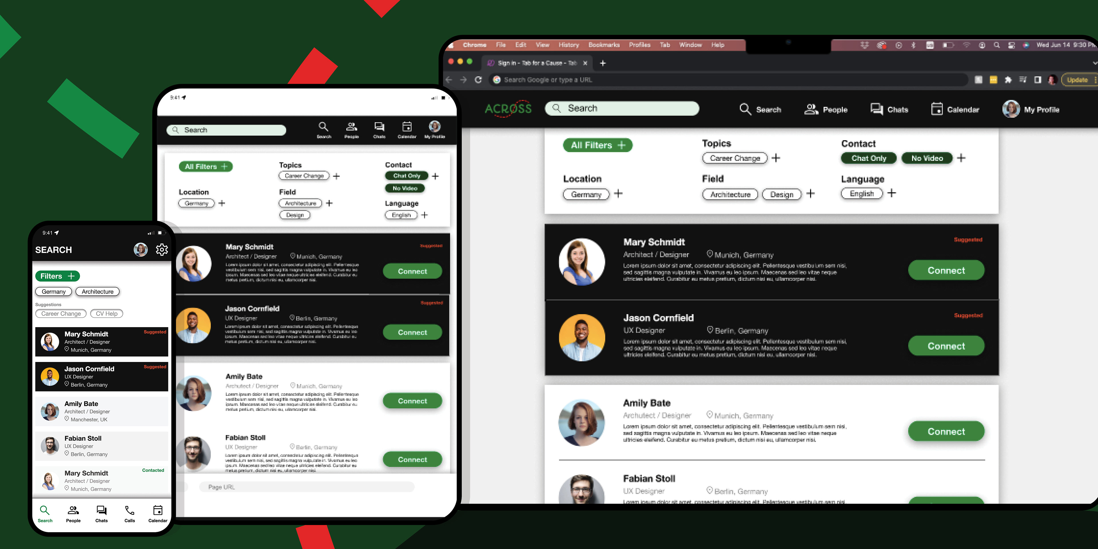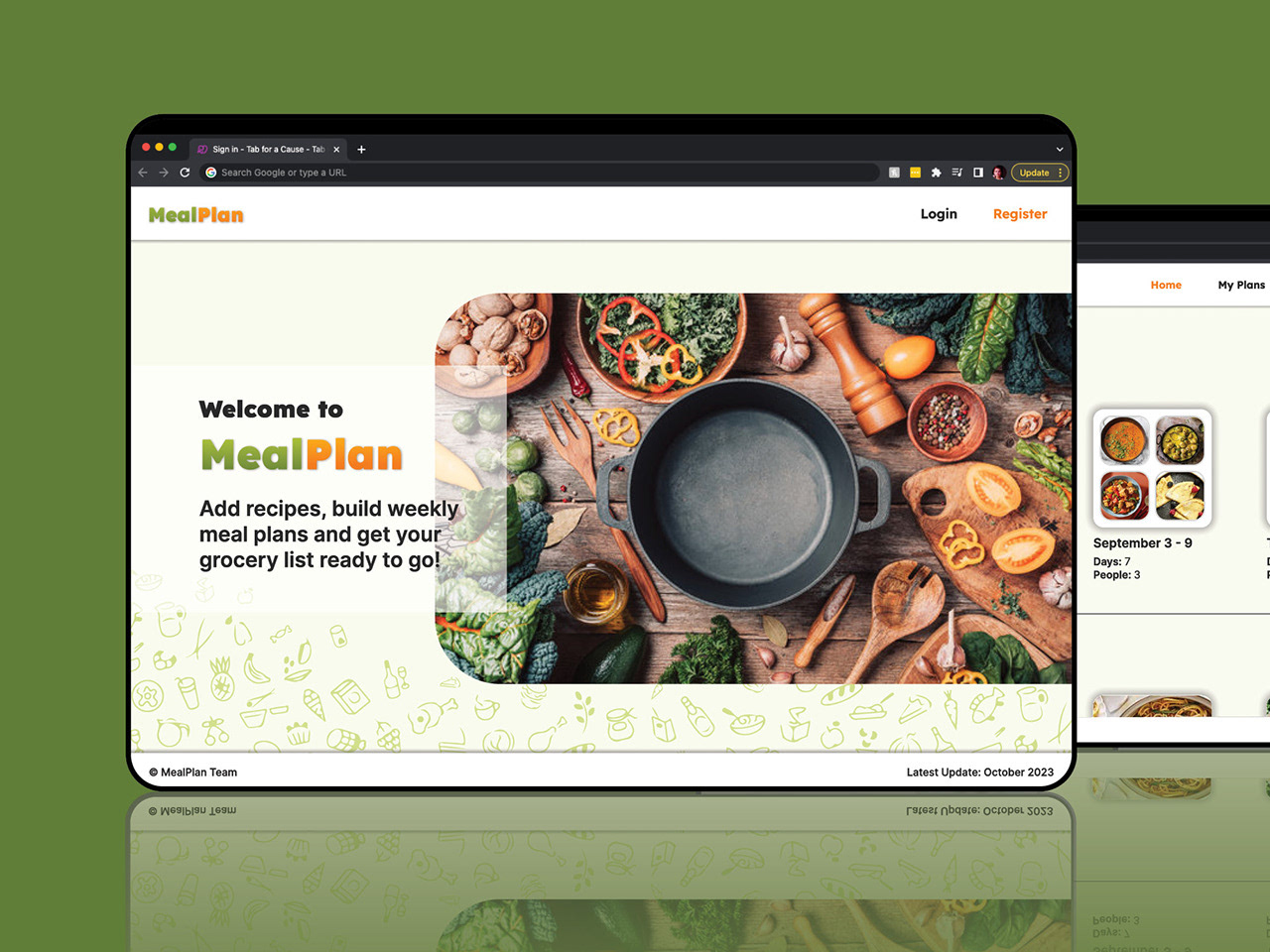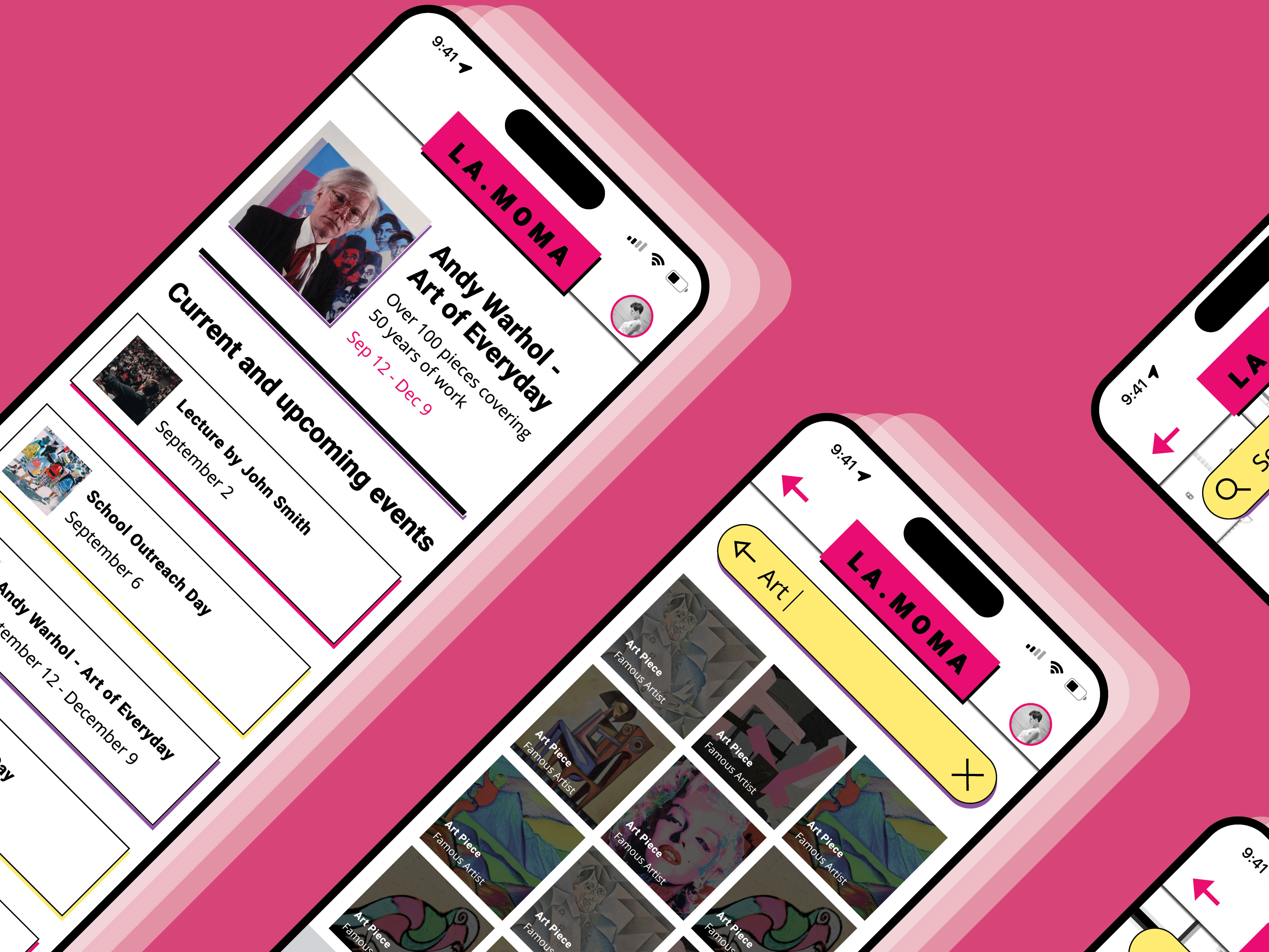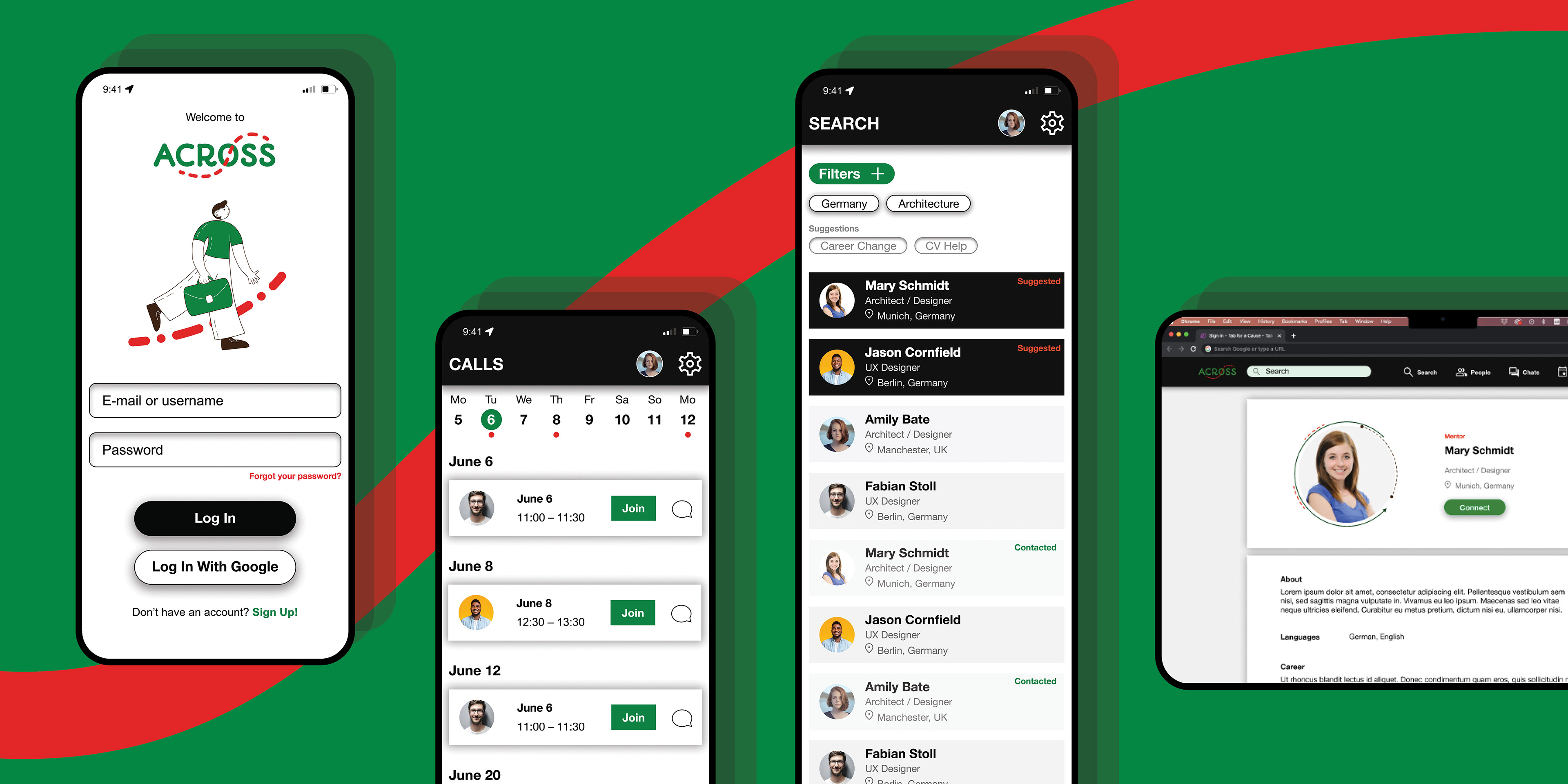
ACROSS is an app that connects refugees with mentors around the world, who can support them through their career journey. It exists as a mobile app as well as an adaptable website in mobile, tablet, and desktop versions.
The project was part of the Google UX Design Course in May-June 2023.
User Research
Through creating personas, and user journey maps, empathizing with users, and identifying user pain points I was able to determine which features the app requires.
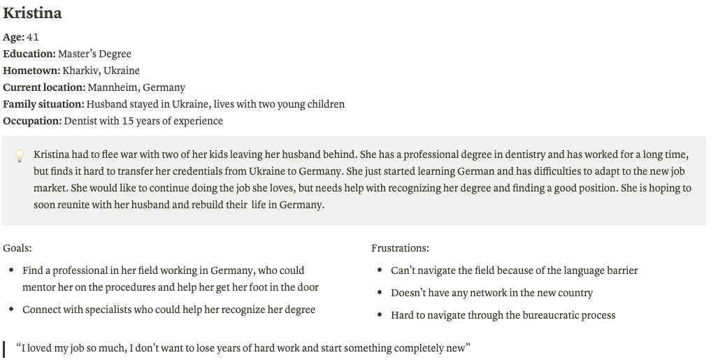
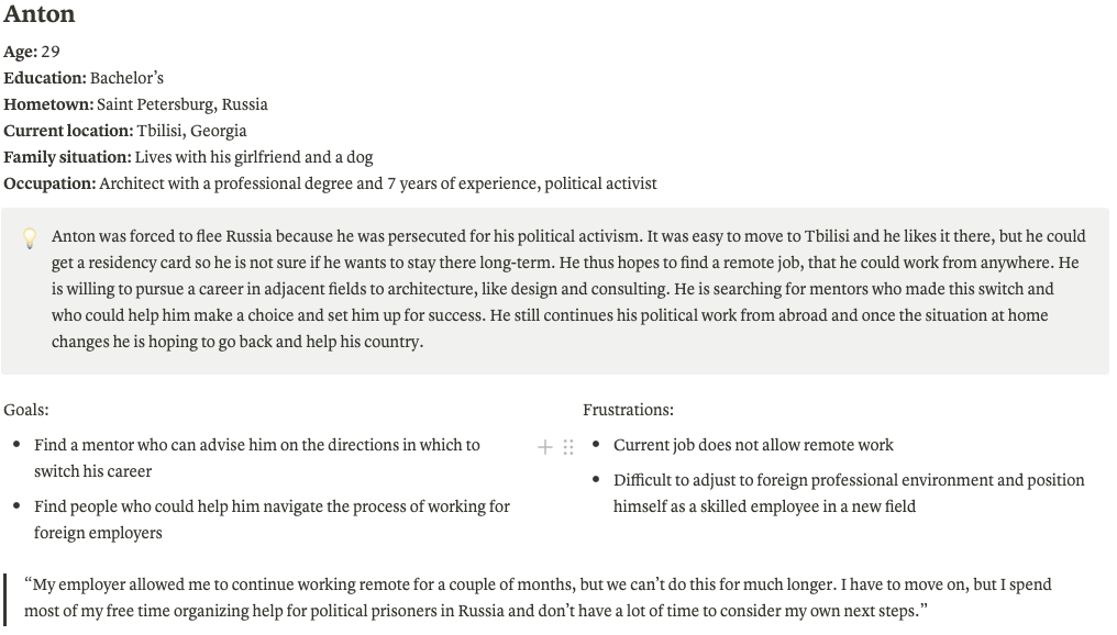

After creating personas and user journey maps I formulated two following problem statements:
1. Kristina is a refugee and a high-skilled professional who wants to find a mentor in her field and build a network because it’s hard for her to navigate a foreign environment in a foreign language on her own.
2. Anton is a refugee with a professional degree and experience who wants to find mentors who can help him make a switch from architecture to a remote career because he needs to be able to work from anywhere and be able to combine his job with his activism.
Wireframing and Low-Fidelity Prototype
I drafted various wireframes on paper and then transferred the most successful ones to a digital medium using Figma.
As the app's target audience primarily uses mobile phones for day-to-day activity in the app, the design of the mobile app was of the highest priority. I thus developed wireframes and the low-fidelity prototype for the mobile app first.
The low-fidelity prototype demonstrates how you can find a mentor and connect with them, chat with your connections, and see your upcoming calls. It also demonstrates the way to edit our profile.
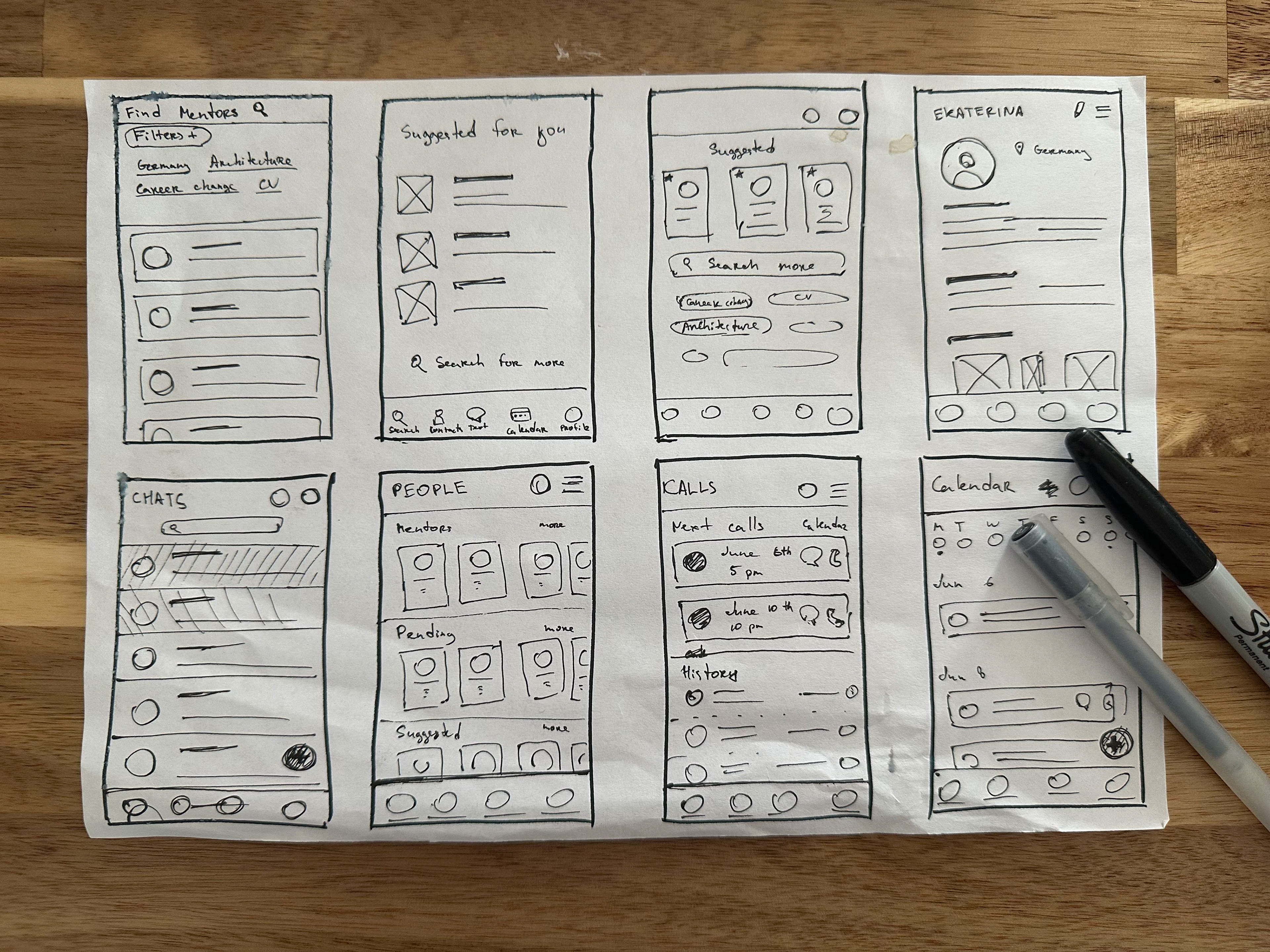
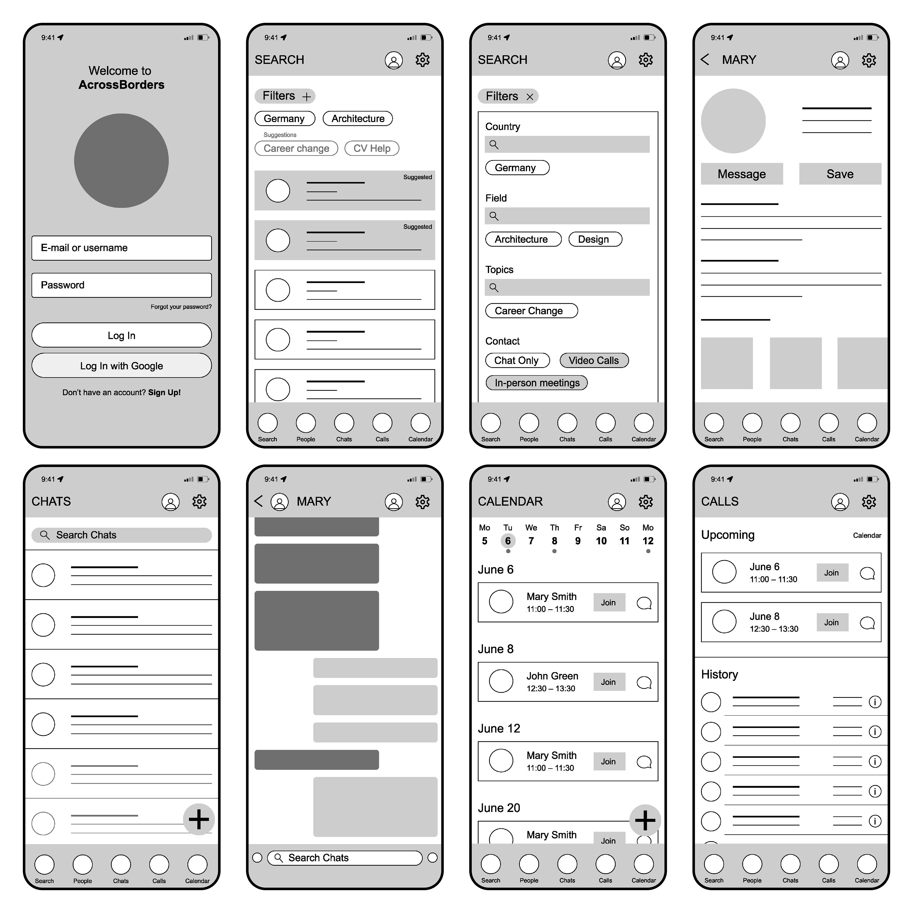
Digital Wireframes
Low-Fidelity Prototype
Usability Research
Unmoderated usability studies were conducted among 4 participants. Users were asked to look at the low-fidelity prototype and accomplish several simple tasks.
The research findings demonstrated the following problems:
• The edit profile screen is not intuitive enough
• The functionality of the top-right button is not clear
• Users would like to see app suggestions in the search
• Pending invitations are not visible
• Login with Google account is needed
After that, the following elements were adjusted:• The functionality of the top-right button is not clear
• Users would like to see app suggestions in the search
• Pending invitations are not visible
• Login with Google account is needed
• Adjusted the layout of the "Edit Profile" Screen
• Replaced the menu icon with a settings icon
• Added suggested options
• Added pending category to chats and connections
• Added a "Log In with Google" button
• Replaced the menu icon with a settings icon
• Added suggested options
• Added pending category to chats and connections
• Added a "Log In with Google" button

Affinity Diagram
Mockups and High-Fidelity Prototype
To refine the visual design I developed a set of elements to use across the app: menu elements, iconography, typography, and color.
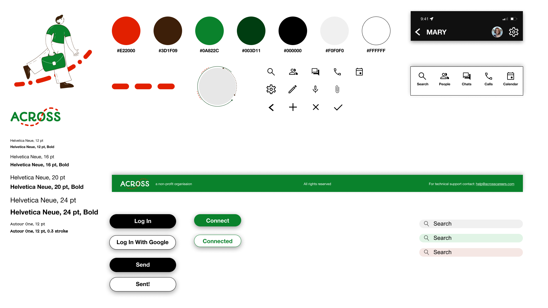
Sticker Sheet
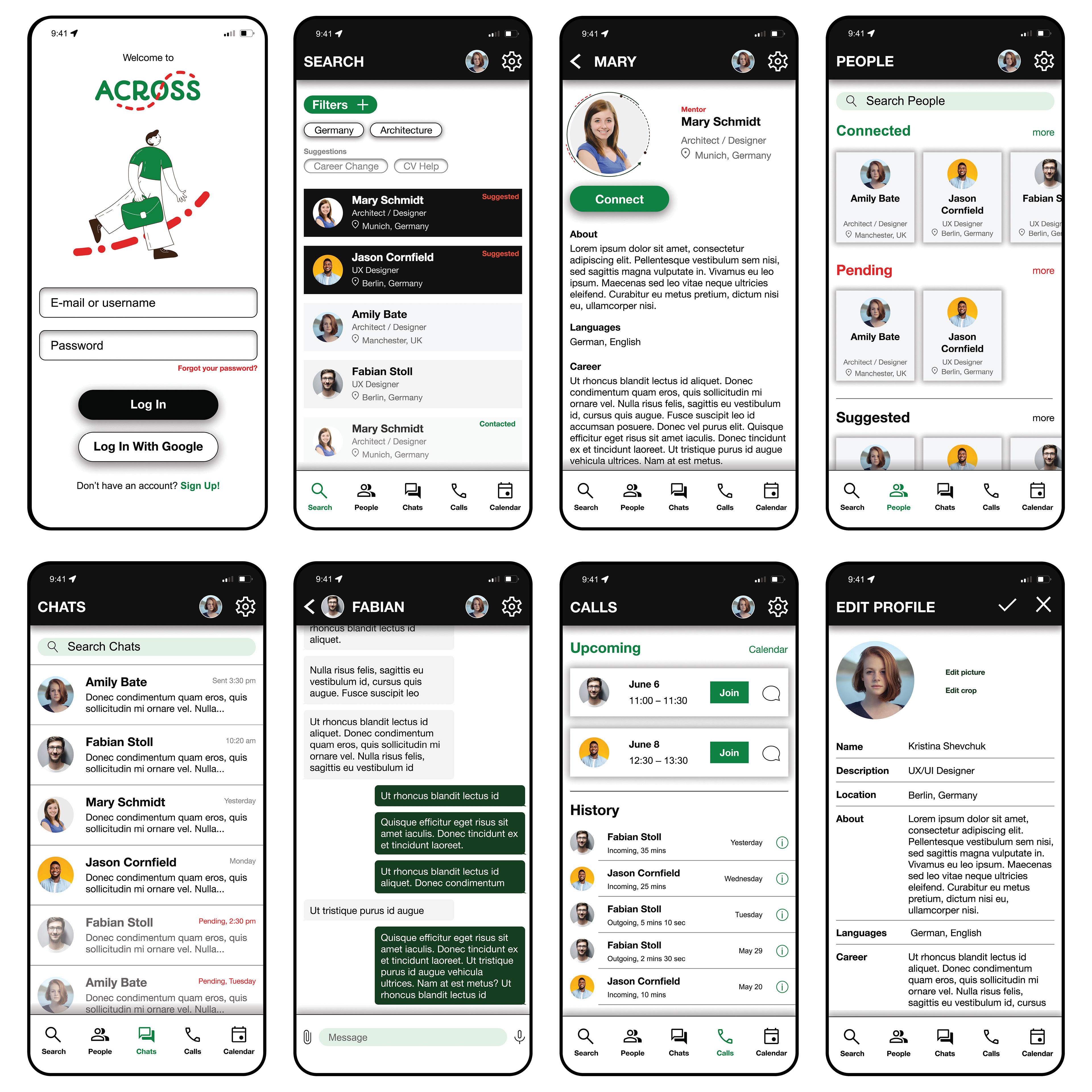
Mockups
High-fidelity prototype
The prototype includes the following accessibility features:
1. Contrast colors, that highlight important elements, and allow for clear navigation. The color contrast satisfies the accessibility requirements
2. Uniform design consistent with similar functionalities in other apps allows for easier navigation through the app
3. There are options to use voice as an input method
Web-versions
After the development of the mobile app, the same design language was applied to enlarge the screens for tablet and desktop screen website versions. Below you can see the comparison of the same screen across the devices.